
RethinkTrends

Priyanshi Kharwade

Why Purpose-Led Brands Go Silent During Controversial Moments

Why Purpose-Led Brands Go Silent During Controversial Moments

Nike, Levi’s, Dove, Gillette and Ben & Jerry’s helped turn purpose-led branding into a valuable business asset. So when that purpose suddenly disappears during a controversial moment, consumers are not being dramatic. They are checking whether the product genuinely came with values or merely values-themed packaging. Because once a brand sells courage, rebellion, inclusion or social justice, silence is no longer neutral. It feels like a product defect. Let’s talk about something I thoroughly enjoy in modern advertising because you will too I promise. A multinational corporation gathers 14 people in a glass conference room, orders ethically sourced coffee and decides it is now the voice of the resistance. Cue the grainy footage. Cue the protest signs. Cue a teenager skating somewhere she has technically been asked not to skate. Add a line about breaking rules, finding your truth or changing the world. Logo. Product. Cannes entry. Fun? Right? But then a real issue arrives. It is divisive. It may upset investors, governments, distributors or that one senior executive who still prints emails. Suddenly, the brand that spoke like a revolutionary becomes quieter than the intern when the client asks: “Who approved this?” That silence feels like betrayal because the expectation did not appear from nowhere. Brands created it. Why Do Consumers Expect Brands to Speak Up? Consumers expect purpose-led brands to speak up because those companies stopped selling only products. They began selling identities, beliefs and moral membership. They told us that buying shoes, jeans, razors, soap or ice cream could also be an expression of who we are and what we stand for. Nike did not build “Just Do It” around sensible footwear decisions. Its 2018 campaign featuring Colin Kaepernick connected the brand with conviction, sacrifice and racial justice. Nike has continued to include its support for Kaepernick within the company’s broader values story. Levi Strauss & Co. has publicly advocated for gun-violence prevention, voting access, equality and racial justice. It established the Safer Tomorrow Fund in 2018 and has repeatedly presented corporate participation in social issues as a responsibility—not a decorative extra. Dove has spent more than two decades positioning its “Real Beauty” platform as a challenge to narrow and unrealistic beauty standards. Its campaigns featured women who existed outside the category’s usual model-perfect template. Ben & Jerry’s openly describes itself as a social-justice company that also makes ice cream. Its public advocacy has covered racial justice, refugee rights, democracy and LGBTQ+ rights. These brands did not merely borrow from culture. They asked consumers to treat purchasing as participation. Lovely. But participation creates expectations. You cannot spend years saying, “We are with you,” and then, during the first genuinely risky moment, respond with: “Your message is important to us. Please allow six to eight business weeks for courage.” Which Brands Created the Expectation of Corporate Activism? Nike, Levi’s, Dove, Gillette, Adidas, Ben & Jerry’s and Patagonia are among the most recognizable brands associated with purpose marketing and corporate activism. Their advertising and business decisions have addressed themes such as rebellion, equality, identity, masculinity, racial justice and environmental action. Gillette, for example, pushed beyond its familiar “The Best a Man Can Get” positioning with “The Best Men Can Be,” a campaign focused on masculinity, role models and personal responsibility. Adidas eventually terminated its Yeezy partnership and estimated that the decision could reduce its 2022 net income by as much as €250 million. That matters because a corporate position becomes much more convincing when an invoice arrives. Purpose is easy when it improves the quarterly presentation. It becomes real when it affects the quarterly results. These brands are not identical. In fact, the differences between them reveal the central problem with purpose-led branding. Patagonia offers one of the clearest examples of brand purpose becoming part of a company’s structure rather than remaining seasonal advertising copy. In 2022, founder Yvon Chouinard transferred ownership of the company so that profits not reinvested in the business could support environmental action. The company announced the move with the declaration that Earth was now its only shareholder. Ben & Jerry’s demonstrates a different tension: a values-led brand operating within a larger corporate structure. The company alleged that Unilever restricted its ability to make public statements about Gaza. Unilever disputed those allegations. The disagreement became part of a wider conflict over the ice-cream brand’s independent social mission. There it is. The brand has a spine. But the conglomerate owns the nervous system. Why Do Big Brands Go Silent During Controversial Moments? Big brands often go silent because a brand is presented as a personality, while a corporation operates as an approval workflow. The public sees one Instagram account. Behind it may sit: A brand team An advertising agency A legal department Regional leadership Public affairs Investor relations Global headquarters Three people whose primary professional skill is saying, “Let us circle back” Everyone can comment. Nobody wants to own the consequence. The safest career move becomes delay. And delay, dressed in corporate clothing, is called “careful consideration.” The commercial risk is also brutally uneven. A brave advertisement may generate attention, awards and cultural relevance. A brave corporate position may trigger boycotts, political pressure, retailer conflict, regulatory scrutiny or uncomfortable shareholder questions. So the company happily approves simulated courage and panics at the cost of the real version. To be fair, boards often have genuine legal and shareholder obligations that make swift public statements riskier than they appear from the outside. That is the gap between brand activism and actual corporate action. One is produced by the marketing department. The other requires the organisation to accept consequences. What Did Brands Learn From Pepsi’s Kendall Jenner Advertisement? Pepsi’s 2017 Kendall Jenner advertisement remains one of the most famous examples of corporate advertising mishandling social protest. The campaign attempted to compress protest, policing and social harmony into a glossy soft-drink moment. It faced immediate criticism for trivialising real social movements and was quickly withdrawn with an apology. The lesson many boardrooms appear to have absorbed was not: “Understand

Why Purpose-Led Brands Go Silent During Controversial Moments Read More »

Everyone Has Taste Now, Apparently

Everyone Has Taste Now, Apparently

At 12:47 on a random day(night), I found myself comparing two lamps. They were, to the untrained eye, the same lamp. Both were small. Both were vaguely Italian-looking. Both gave off the emotional energy of a dentist’s waiting room that had recently discovered jazz. One cost a reasonable amount of money. The other cost enough that I briefly wondered whether it came with a minor European title. I sent screenshots to a friend. “The second one has more taste,” she replied. Not “it looks better.” Not “the shape is nicer.” Not even “buy that one.” It had more taste, as though taste were a rare mineral embedded in the ceramic, detectable only by people who own at least one chair nobody is allowed to sit on. I stared at the lamps for another twenty minutes, which is how I lost custody of my time. The next morning, the word was everywhere. A founder was talking about taste in product design. A writer was explaining why taste would survive artificial intelligence. A creative director was posting about “training taste.” Someone on a podcast said execution was becoming cheap and taste was becoming valuable. I opened another app and was informed that a beige kitchen had “timeless taste,” despite looking like a place where even the salt had signed an NDA. Apparently we have entered the Age of Taste. This is surprising because, until recently, taste was mostly something your aunt accused you of lacking when you wore sneakers to a wedding. Now it is a career strategy, a technological moat, a personality, a leadership principle, a content category, and possibly the last defense of the human soul. Naturally, I became obsessed with why everyone else was obsessed. The Word That Ate the Internet The current taste fever did not appear from nowhere, although it did arrive with the usual confidence of a person entering a conversation halfway through and immediately correcting everyone. In early 2026, tech people began arguing publicly that when artificial intelligence makes production easy, the scarce skill will be deciding what deserves to exist. Paul Graham revived an argument he had made years earlier about taste among makers; OpenAI president Greg Brockman called taste a new core skill; and the discussion ricocheted through the usual online corridors where a thought begins as a reasonable observation and ends twelve hours later as a personal brand. Kyle Chayka, writing in The New Yorker, noticed that “taste” had become a Silicon Valley cliché on the scale that “disruption” once was. Companies and founders were using it to describe everything from product judgment to recommendation tools, design software, and the ability to pick profitable ideas before everyone else. He called part of this phenomenon “taste-washing”: wrapping automation in the language of human sensitivity so the machine feels less like a machine and more like a thoughtful person who buys olive oil in an opaque bottle. This explains the suddenness. AI did not invent our interest in taste. It created a panic around it. For years, the internet rewarded output. Post more. Ship faster. Publish daily. Make a video, then make the same video vertically, then crop it into a square, then turn the square into a newsletter, then stand in a field and explain the newsletter into a tiny microphone. Generative AI looked at this exhausting arrangement and said: I can produce infinity before lunch. The moment supply becomes infinite, selection becomes theatrical. The person who can say “not that, this” begins to look powerful. Taste is what we call that pointing finger when we want it to sound profound. We Have Been Here Before, in Worse Hats The funny thing about taste is that it always pretends to be private while behaving like a group project. I like this painting. I hate that sofa. This album changed my life. Those shoes are a crime. We describe these reactions as if they emerged from a sealed chamber inside the self, untouched by class, money, geography, friends, advertising, childhood, envy, convenience, and the fact that an attractive person once wore something similar near us. History is less romantic. In 1899, Thorstein Veblen wrote about conspicuous consumption: people buying and displaying things partly because those things communicate status. He was especially interested in objects whose uselessness or expense was the point. A difficult-to-maintain possession tells the world that you can afford difficulty. This remains the governing philosophy of white sofas, tiny handbags, and any sink that requires special instructions. Decades later, Pierre Bourdieu’s Distinction argued that taste helps organize social class. Preferences are not merely preferences; they become signals of education, upbringing, access, and belonging. Knowing which wine, book, neighborhood, composer, restaurant, or deliberately ugly jacket to approve of can function like a password. Cultural capital is wealth that has learned to speak softly. This does not mean nobody genuinely loves difficult jazz. Some people do. I admire them and fear their car journeys. It means taste has always done two jobs at once. It gives us pleasure, and it places us socially. The internet simply put the placement system on a dashboard. You no longer need to invite someone into your home to reveal your preferences. Your bookshelf is photographed. Your meals are archived. Your music arrives in an annual graphic report. Your clothes appear in tagged posts. Your saved folders contain enough evidence to reconstruct you after a minor disappearance. Taste used to leak out accidentally. Now it has a content calendar. The Factory Can Make Anything Except a Decision There is a basic economic reason taste suddenly feels important: production is getting cheaper while attention remains stubbornly mortal. A model can generate twenty logo directions while I am still deciding whether “direction” means anything. It can create a hundred images, draft ten headlines, suggest fifty names, redesign the landing page, and produce a presentation in which every slide appears to have been raised by the same highly competent aquarium. This is genuinely useful. It is also a problem. When you

Everyone Has Taste Now, Apparently Read More »

Cyberdecks: Custom DIY Portable Computers and Their Rising Trend

Tech With Personality: What Are Cyberdecks, How Are They Made and Why Are They Trending?

Tiny screen? Check. Mechanical keyboard? Check. Mysterious switches nobody else understands? Absolutely. Open the case and you might find a miniature screen glowing beside a mechanical keyboard, a Raspberry Pi tucked beneath a web of wires and a collection of switches whose purpose only the builder fully understands. The outside may be covered in stickers, pearls, translucent plastic or hardware-store bolts. Nothing looks factory-made, and that is exactly the point. A cyberdeck is a custom-built portable computer assembled around the needs, imagination and aesthetic of its maker. Some live inside rugged equipment cases. Others appear in purses, makeup boxes, seashell-inspired shells or repurposed packaging. They are part computer, part craft project and part personal statement. Once associated mainly with cyberpunk fiction, hacker culture and post-apocalyptic design, cyberdecks are now being reinvented by a wider generation of makers who want technology to feel personal again. We have faster and more polished machines than ever, yet many are anonymous, sealed, difficult to repair and almost impossible to make truly our own. Cyberdecks offer the opposite experience: visible mechanisms, creative control and the satisfaction of building something by hand. The fascination is not really about replacing a laptop. It is about recovering something consumer technology has gradually taken away: the pleasure of understanding a machine, changing it and leaving evidence of yourself in the final object. So what exactly makes a computer a cyberdeck? Where did the idea come from, what do people use these machines for, and how difficult is it to build one yourself? What Are Cyberdecks, Exactly? A cyberdeck is a portable computer designed and assembled by its owner rather than purchased as a finished device. There is no formal engineering standard, but most cyberdecks share four qualities: they are portable, personally assembled, visibly customised and created around a particular purpose or fantasy. A typical build combines a small computer board with a compact display, keyboard or custom controls, storage, a power source and a handmade or repurposed enclosure. Some also include software-defined radio, environmental sensors, offline maps, local archives, retro games or cybersecurity tools. That makes a cyberdeck different from a laptop. A laptop is a finished general-purpose product whose shape, components and assumptions were chosen by a manufacturer. A cyberdeck is closer to a working prototype, an art object and a personal tool at the same time. A laptop asks, “What might the average customer need?” A cyberdeck asks, “What do I want this machine to do?” One clarification is useful: the device is generally called a cyberdeck, not a “cybertech”. The term has fictional roots going back more than 40 years, although the recognisable real-world hardware movement developed much later. Where Did Cyberdecks Come From? Cyberdecks did not begin as Raspberry Pi projects. Their history runs through personal computing, cyberpunk fiction and the modern maker movement. In the 1970s, microprocessors helped move computing away from institutional mainframes and towards hobbyist machines that individuals could programme and modify. The Smithsonian notes that early personal computers gave individuals access to tools previously controlled by businesses and corporations, although those machines often demanded considerable technical effort. Historian Fred Turner connects this period to countercultural ideas about decentralisation, information sharing and personal empowerment. The computer was imagined not only as a product, but as a tool through which individuals could resist bureaucracy and expand their own capacities. The word itself comes from William Gibson’s 1984 novel Neuromancer, where a custom “cyberspace deck” allows a hacker to enter a networked virtual realm. Gibson’s machine belonged to cyberpunk’s larger suspicion of corporations, concentrated power and technology that alters the human nervous system. Real-world cyberdecks emerged gradually from maker, hacker and science-fiction communities. The r/cyberDeck community dates to 2016, and Hackaday was documenting Raspberry Pi cyberdeck builds by 2019. So the claim that cyberdecks “have been around since the 80s” is only partly accurate: the fictional concept dates to 1984, while the recognisable online hardware movement developed decades later. By 2026, brightly decorated and highly individual cyberdecks were attracting wider attention online. Builds by creators such as Annike Tan reached millions of viewers, while Raspberry Pi highlighted the growing number of women bringing new styles and ideas into the maker community. What Is Inside a Cyberdeck? Cyberdecks look wonderfully chaotic from the outside, but most are built from a recognisable set of parts. The computer The brain is often a Raspberry Pi or another single-board computer, although builders may also use a mini PC, an old smartphone, a microcontroller or salvaged laptop hardware. The choice depends on the deck’s size, power needs and intended job. The Raspberry Pi is popular because it compresses a capable computer into a small board while leaving ports and hardware interfaces accessible. Current Raspberry Pi 5 models provide a quad-core Arm processor, external display support and general-purpose input/output connections, giving builders enough power for ordinary Linux tasks as well as specialised hardware projects. The display Most decks use a compact HDMI, USB-C or touchscreen display. Some builders choose a wide screen for writing or terminal work; others deliberately use a tiny screen because it fits the object’s fantasy, even if it is less practical. The controls Input may come from a mechanical keyboard, miniature keyboard, trackball, joystick, rotary knobs, toggle switches or programmable buttons. A mysterious switch is sometimes practical and sometimes there because mysterious switches are fun. The power system A portable deck needs a battery or external power source. Beginner builds commonly use a ready-made USB power bank. More advanced makers may design custom battery and charging systems, but power management and heat are among the parts of a build that require the most care. The enclosure The enclosure gives a cyberdeck its identity. It may be a rugged case, toolbox, handbag, makeup case, vintage electronics shell, 3D-printed body or something rescued from the recycling bin. Inside, brackets, panels, screws and adhesive mounts keep the components from becoming an expensive maraca. The extras Depending on its purpose, a deck may include speakers, antennas, cameras, sensors, GPS,

Tech With Personality: What Are Cyberdecks, How Are They Made and Why Are They Trending? Read More »

Why Are So Many Players Wearing Pink Cleats at the World Cup 2026

Why Are So Many Players Wearing Pink Cleats at the World Cup 2026?

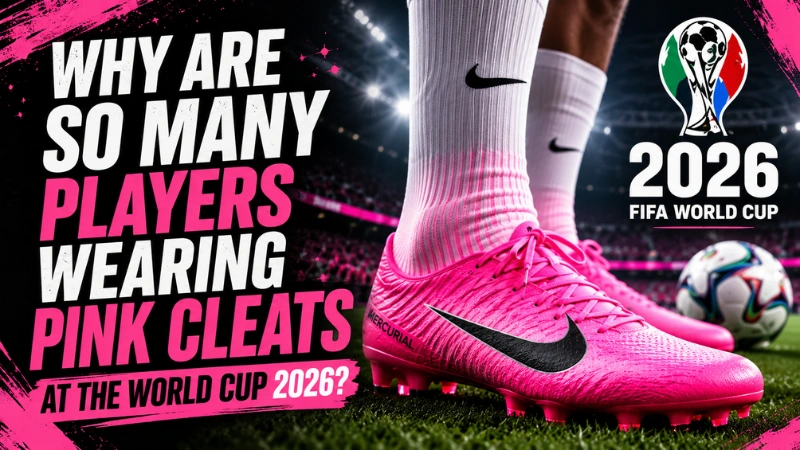
Players are wearing pink cleats at the FIFA World Cup 2026 because pink is one of the easiest colors to see on a green soccer field. It pops on grass, looks sharp on TV, survives tiny mobile-screen highlights, and rarely clashes with national team uniforms. That is the quick answer. But the better answer is much more interesting: this is what happens when Nike, Adidas, Puma, New Balance, Skechers and other brands all solve the same marketing problem using the same data. They all wanted one thing: visibility. They all looked at the same green pitch. They all saw the same 2026 color trend. They all reached the same conclusion. And now, almost everyone looks the same. The World Cup pink cleats trend is not just a fashion moment. It is a perfect sports marketing case study about color science, trend forecasting, brand sameness, and the weird comedy(tragedy) of billion-dollar companies accidentally joining the same group chat. The simple reason pink cleats work on a soccer field A soccer field is a giant green canvas. That is important. When a player is sprinting, turning, shooting, or sliding, the cleats are small and moving fast. For a brand, that creates a problem. How do you make a tiny product visible in a match full of bodies, grass, shadows, camera cuts, and motion blur? You choose a color that fights the background. Pink does that extremely well. FOX Sports reported that pink cleats stand out strongly against the green pitch and are highly visible for fans watching in stadiums, on TV, and on mobile screens. The same report also noted another useful detail: no participating World Cup country has a primarily pink uniform, so the cleats do not usually disappear into the kit. That makes pink both practical and commercial. It is not just “pretty.” It is engineered attention. This matters because modern soccer is watched everywhere. A World Cup goal is not only seen live. It becomes a replay, a TikTok clip, an Instagram reel, a thumbnail, a meme, a boot review, and a screenshot. A cleat color has to work across all those formats. Pink works because it is loud even when the screen is small. Why pink cleats became the World Cup’s unofficial uniform The funny part is that pink was supposed to create difference. Instead, it created sameness. Adidas, Nike, Puma, New Balance, and Skechers all released pink-themed cleats for the 2026 World Cup, with different brand names and slightly different shades. Adidas had “Solar Turbo.” Puma had “Poison Pink.” Other brands had their own versions too. On a product page, those cleats may look different. A boot nerd can identify the soleplate, the upper, the logo placement, the texture, the silhouette, the athlete association. But on a wide broadcast angle? Most people just see pink. That is the problem. The color made the footwear visible, but it made the brands harder to separate. Page Six reported that sneaker observers saw the trend as a possible branding backfire because so many companies released similar pink-toned cleats at the same time, making individual brands less distinct. In other words, the brands won the visibility battle together. And because they won it together, no one clearly won it alone. Pink Cleats Are Actually A Trend Forecasting. The pink cleats did not appear randomly. World Cup products are planned years in advance. Brands have to design the cleats, test them, sign off with athletes, manufacture them, prepare campaigns, ship them to retailers, and launch them at the perfect moment. Nike and U.S. Soccer executives have publicly discussed how World Cup preparation can involve years of planning, including four years of tournament prep and a six-year jersey design process. So the color decisions for many 2026 World Cup products were likely made long before fans saw the cleats on the field. This is where WGSN and Coloro enter the story. WGSN and Coloro identified “Electric Fuchsia” as one of the key colors for Spring/Summer 2026. WGSN described it as a vivid neon shade between pink and purple, with a kinetic and digital quality. That description almost sounds designed for World Cup cleats. Bright. Digital. Youthful. Energetic. Perfect for screens. Perfect for clips. Perfect for a tournament built around global attention. The Guardian also connected hot pink’s World Cup dominance to WGSN’s earlier forecast that bright pink, described as electric fuchsia, would be popular in 2026. So no, Nike, Adidas, and Puma probably did not sit in a secret room and decide, “Let us all make the same pink cleats.” The more likely explanation is funnier. They all read the same signals. The self-fulfilling prophecy of pink cleats Trend forecasting is often treated like prediction. But in industries this big, it can become something closer to instruction. Here is how the loop works. A major trend agency says electric fuchsia will be important in 2026. Big brands build collections around electric fuchsia. Retailers stock electric fuchsia. Athletes wear electric fuchsia. Fans see electric fuchsia everywhere. Then everyone says, “Wow, electric fuchsia is really trending.” But did the trend happen naturally? Or did the industry build the trend because everyone believed the forecast? That is the fascinating part. The pink cleats trend feels like a self-fulfilling prophecy. The forecast did not merely describe the future. It helped manufacture it. And because many brands subscribe to similar trend intelligence, they often move in similar directions at similar times. The result is not always innovation. Sometimes it is synchronized sameness. That is exactly what seems to have happened here. The brands were trying to stand out, but they were all using the same map. Why this is such a strange branding failure The whole point of a World Cup cleat pack is differentiation. A brand wants you to see a player score and instantly think: Nike. Adidas. Puma. New Balance. Skechers. It wants the boot to carry identity. But if too many brands use the same color family, that identity gets blurry. The 2026 World

Why Are So Many Players Wearing Pink Cleats at the World Cup 2026? Read More »

How Waka Waka Became Bigger Than FIFA’s Marketing

How Waka Waka Became Bigger Than FIFA’s Marketing

Some World Cup songs become popular for a few weeks, then the tournament ends, the trophy is lifted, the sponsors move on, and the song slowly disappears from public memory. Waka Waka (This Time for Africa) did not disappear. Shakira’s 2010 World Cup song became something much bigger than a normal tournament anthem. It became the sound people connect with South Africa 2010. Even people who do not remember every match still remember the feeling of that World Cup when the song starts playing. That is what makes Waka Waka special. It was not just a song made for a football event. It became a memory machine. People remember Spain winning the trophy. They remember Andrés Iniesta’s goal in the final. They remember the vuvuzelas, Paul the Octopus, Ghana’s painful exit, and the bright colors of the South African stadiums. But somewhere behind all those memories, Waka Waka is playing like background music in the brain. That is unusual for a marketing song. Most official songs feel like they were made in a meeting room. Waka Waka felt like it had lived many lives before FIFA touched it. The Song Had A History Before Shakira The most interesting thing about Waka Waka is that its famous chant did not begin with Shakira. The chant comes from Zangalewa, a 1986 song by the Cameroonian group Golden Sounds. This detail changes the whole story. Waka Waka was not created from nothing in a studio. It was built on an older African song that already had its own history, rhythm, humor, and cultural meaning. A deeper breakdown by Afropop Worldwide explains why Zangalewa is not just a random old song. It had military roots, comic energy, and a strong Cameroonian identity. It sounded like a march, a joke, and a dance track at the same time. Golden Sounds were not just a regular pop group. The group had links to Cameroon’s military world, and Zangalewa carried the feeling of a chant that had already moved through public life before it became part of a global hit. That is why the chant works so well. You do not need to understand every word to feel it. It has the kind of rhythm that makes people join in before they even know what they are singing. This is one reason Waka Waka felt old and new at the same time. Shakira gave it a global pop shape, but the heart of the song came from a chant that had already traveled across places and generations. By the time FIFA used it for the 2010 World Cup, the chant already had cultural weight. FIFA gave it a huge stage, but the song’s power came from a much deeper place. Freshlyground Made The Song Feel Connected To South Africa There was also a real debate when Waka Waka was chosen. The 2010 World Cup was the first men’s FIFA World Cup held in Africa. Because of that, many people felt the official song should have been led by an African artist. When FIFA chose Shakira, a Colombian superstar, some fans and critics were not happy. Their question was fair. If the World Cup was finally coming to Africa, why was the main voice not African? This is where Freshlyground became important. Freshlyground is a South African band, and their role gave the song a local connection. Their sound brought warmth, guitar, rhythm, and a strong South African flavor. They helped the song feel less like a foreign pop star singing about Africa and more like a collaboration with African musicians inside it. The controversy is part of the reason the song is still interesting. A PBS NewsHour piece from 2010 covered the criticism around the song and the debate over African representation. That debate did not make the song weaker. It made the story around the song more complex. Waka Waka is joyful, but it also opens a bigger question about global pop. Who gets to represent a culture? Who gets the credit when older sounds become new hits? What happens when a local song becomes part of a worldwide brand? Those questions make the song more than just catchy. They make it a case study. Why Waka Waka Beat Other World Cup Songs Most World Cup songs try very hard to sound important. They use big words about unity, dreams, glory, and destiny. The problem is that many of them end up sounding like a sponsor speech with drums behind it. Waka Waka was different because it did not feel heavy. It felt alive. The chorus was simple. The rhythm was easy to follow. The dance was easy to copy. The song had movement built into it. You could play it in a stadium, at school, in a car, at a party, or over a football highlights video, and it would still work. That is the real test of a football song. People do not listen to football songs the way they listen to sad album tracks in headphones. Football songs are shouted, danced to, replayed, remixed, and half-sung by people who may not know all the words. Waka Waka understood that better than almost every other official anthem. It had a chant instead of only a chorus. That matters because chants belong to crowds. A normal chorus can make people sing along, but a chant makes people feel like they are part of something bigger. That is perfect for football, because football is already built around crowds, noise, rhythm, and shared emotion. The Numbers Prove It Lasted The song did not only survive in memory. It also survived in numbers. According to Guinness World Records, Waka Waka became the most streamed FIFA World Cup song on Spotify. That matters because streaming numbers show that the song did not only belong to 2010. People kept returning to it years later. Its official video also became one of the most watched music videos connected to football culture. That is not normal for a tournament song. Most

How Waka Waka Became Bigger Than FIFA’s Marketing Read More »

The Invisible Wall: Why I Walked into a Glass Door

The Invisible Wall: Why I Walked into a Glass Door (And Why I Genuinely Dislike Walter Gropius and Mies van der Rohe)

How two dead architects are still giving people headaches in 2025.  I am currently typing this while holding an ice pack to my face. Just a few minutes ago, I was walking confidently into a room, minding my own business, when, BAM. I face-planted directly into a perfectly clean, completely invisible glass office door. As I stood there rubbing my head in front of my deeply amused coworkers, my embarrassment quickly turned into pure, unadulterated spite. Who decided this was a good idea? Who looked at a solid, perfectly functional wooden door and thought, “No, let’s make it look like thin air so people can smash their head into it? As it turns out, I have two specific men to blame for my current headache: Walter Gropius and Ludwig Mies van der Rohe. Back in the mid-20th century, these two legendary German architects decided that heavy walls were out, and total transparency was in. They championed the “less is more” philosophy, filling the corporate world with sleek steel, open floor plans, and the curse of the seamless glass door. They wanted to flood our workspaces with natural light and break down visual barriers. Well, Walter and Mies, congratulations. Your architectural masterpieces have successfully broken down my visual barriers and very nearly broke my head. While these guys were busy designing the futuristic, minimalist offices we work in today, they clearly forgot to account for two major things: ultra-effective modern glass cleaners and distracted human beings. A Brief History of How Glass Conquered the Office Before we litigate the sins of Bauhaus, a little context helps. The all-glass office aesthetic did not appear overnight. It evolved over nearly a century, and its architects genuinely believed they were improving human life. Walter Gropius founded the Bauhaus school in 1919 in Germany, a movement that fused fine art with functional design and became one of the most influential design philosophies of the 20th century. His 1925 Bauhaus building in Dessau featured massive glass curtain walls, an almost theatrical statement that buildings did not need to hide behind brick. Mies van der Rohe took it further. His famous Barcelona Pavilion (1929) and later the Seagram Building in New York (1958) established the glass-and-steel tower as the definitive symbol of corporate modernity. “Less is more” was not a slogan, it was a manifesto. By the 1960s and 70s, every serious corporation wanted a glass tower. By the 1990s, even the interior offices had gone transparent. And by the 2000s, the all-glass open-plan office was simply “how offices look.” No one stopped to ask whether human beings, distracted and caffeinated, were neurologically equipped to navigate walls made of nothing. The Bright Side: Why Offices Actually Love Transparency Architects do not design glass offices just to watch employees bump into things. There are genuine, research-backed psychological and spatial benefits to all this transparency. Natural Light Boost: Glass lets sunlight from exterior windows travel deep into a building’s interior. Research published in the Journal of Clinical Sleep Medicine found that workers with window access slept 46 more minutes per night and reported better quality of life compared to those in windowless offices. More daylight = better mood, better sleep, better output.  The Open-Door Effect: Transparent walls flatten corporate hierarchies. Seeing a manager visibly working at their desk, rather than hidden behind an opaque door, makes leadership feel more accessible. Harvard Business Review research has consistently linked office transparency with higher employee trust scores and a stronger sense of psychological safety. The Illusion of Space: Solid walls carve a floor plan into a maze of isolated boxes. Glass eliminates visual dead ends, making even a modest office feel expansive. This is not just aesthetics. Research in environmental psychology links perceived spaciousness with reduced stress and improved cognitive performance. Acoustic Transparency (sort of): While glass is not soundproof, modern acoustic glazing systems can actually dampen sound transmission, giving you the visual openness of a glass wall with more acoustic privacy than you might expect. The intentions were noble. The execution? That is where it gets complicated. The Dark Side: The Neuroscience of the Face-Plant So why does your perfectly functional brain fail to detect a massive sheet of glass that is right in front of your face? The short answer: your brain is running on autopilot, and autopilot does not check for glass. Your visual system does not record everything it sees. It takes shortcuts. When you scan a path ahead and detect no visual interruption, no shadow, no frame, no texture, your brain concludes the path is clear and signals your legs to keep moving. This is called predictive coding, a neurological efficiency strategy where the brain anticipates the world based on prior experience rather than processing every stimulus fresh. Clean glass defeats predictive coding. It offers no visual data to process. Your brain sees “clear path” and commits. Add to this the phenomenon of inattentional blindness, the well-documented tendency for humans to miss obvious stimuli when their attention is focused elsewhere. If you are glancing at your phone, mid-conversation, or simply thinking about your next meeting, your attentional resources are already allocated. The glass door does not compete. It is not a vision problem. It is a resource allocation problem. Your brain decided the path was clear and spent its processing budget elsewhere. The glass had no lobbyist. This is also why glass collisions are not evenly distributed across the population. Extroverts, people in conversations, and anyone multitasking are disproportionately at risk. The more your brain is engaged elsewhere, the more it relies on shortcuts. And shortcuts do not account for Mies van der Rohe. It Is Also a Bird Problem (A Serious One) If you think humans have it bad, spare a thought for birds. The American Bird Conservancy estimates that between 600 million and 1 billion birds are killed annually in the United States alone by colliding with glass. It is one of the leading human-caused sources of bird mortality, behind only habitat loss. Birds

The Invisible Wall: Why I Walked into a Glass Door (And Why I Genuinely Dislike Walter Gropius and Mies van der Rohe) Read More »

How To Reach Your Ideal Audience Without Wasting Ad Spend

How To Reach Your Ideal Audience Without Wasting Ad Spend

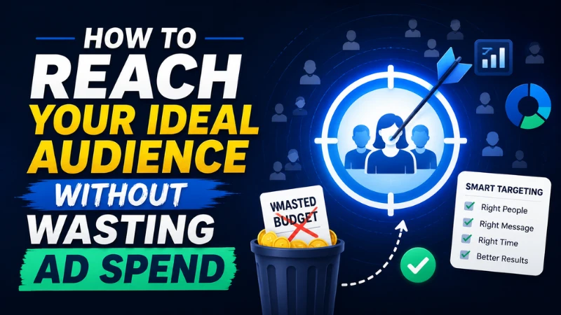
A moment too familiar to all of us is when that uncanny silence settles in right after the mid-campaign ad dashboard is displayed. You can see the budget line depleting, your Click-Through Rate (CTR) looks defensible on paper but the conversions are rather thin. In the back of your mind, you are well aware of what happened. You are well aware that you paid to reach the people that just weren’t going to buy. It’s like you took a month’s budget and scattered it across the internet’s ambient noise, hoping it would echo back at you. All of us marketers have been there, what is even more unsettling is a truth that some, continue to be there, campaign after campaign. It’s not like they lack intelligence or the resources, but a default logic of digital advertising is structurally tilted toward reach over relevance. It’s not a secret that platforms earn more when you spend more. Broader targeting feels safer when a campaign launches. And the vanity metrics such as impressions, reach, and clicks are designed to look like progress even when they aren’t producing outcomes. What follows isn’t a listicle of quick hacks. It’s a closer examination of why ad spend leaks, what the behavioral and mechanical systems underneath that bleeding look like, and how the marketers who’ve stopped haemorrhaging budget are thinking about audiences differently, not as a demographic to capture, but as a pattern of intent to recognize. The Illusion of Reach Somewhere in the early 2010s, digital advertising sold itself on a promise that felt almost utopian: you could reach anyone, anywhere, with surgical precision. The internet had data. Platforms had profiles. Targeting had arrived. The era of guessing was over. It was, in retrospect, a more complicated story. What platforms actually offered wasn’t precision, it was scale. Reach became the primary currency, and cheap reach felt like a bargain. Marketers optimized for impressions. CMOs reported on awareness. And the feedback loop between spending and acquiring actual buyers grew longer, murkier, harder to trace. The researcher Nico Neumann, whose work on digital ad effectiveness has been quietly unsettling to the industry for years, found in multiple studies that even sophisticated audience targeting often performs only marginally better than random targeting at scale. The problem isn’t the technology. It’s the assumption that visibility equals relevance — that showing up in someone’s feed is meaningfully different from showing up in their intent. I read a piece from decentriq that said something along the lines of a cheap reach does not equal cheap advertising. What you’re actually buying when you optimize for impressions is the probability of being ignored at scale. This is the foundational tension that every media buying decision lives inside: the algorithmic economy rewards volume, but volume and value are rarely the same thing. And the gap between those two things is where ad budgets go to disappear. Your Existing Data Is the Map You’re Not Reading Most marketers, when launching a new campaign, treat audience building like a blank page. They open the targeting interface, select a few interests, adjust an age range, layer in a behavior or two, and then release the campaign into the algorithmic wild, trusting that the platform’s optimization engine will do the rest. What they’re overlooking is that they already have a document written in the behavioral language of real buyers that sits inside their CRM and website analytics. Their existing customers aren’t just revenue, they’re a diagnostic. They encode patterns: how people found the product, what they read before converting, which channels they came from, what language they used in support tickets and reviews when they described their problem before they knew a solution existed. This is the most underleveraged move in audience strategy. Mining your own customer data, not for demographics, but for behavioral signatures gives you something no targeting interface can manufacture: evidence. When you look at the exact phrases your customers used in reviews or support conversations, you’re essentially reading the pre-purchase internal monologue of your buyer. Feed that language back into your ad copy and your audience targeting, and the match rate between ad and attention shifts noticeably. Job titles, geography, buying frequency, the specific feature that tipped someone from consideration to conversion, all of this lives in data that most marketing teams treat as a reporting artifact rather than a strategic asset. 01 Mine Your CRM Before You Touch a Targeting Interface. Pull your top 10–15% of customers by Lifetime Value (LTV). Identify what they share, not just demographically, but behaviorally. Map the language they used to describe their problem before they found you. That vocabulary is your targeting brief. It belongs in your ad copy before it belongs in an interest category. The Exclusion Nobody Talks About Ad targeting conversations almost always focus on who to include. The question that tends to be quieter, but is often worth significantly more in recovered budget, is who to exclude. Showing acquisition ads to recent buyers is one of the most common and quietly expensive mistakes in digital advertising. A customer who purchased three weeks ago doesn’t need to be converted. They need onboarding content, cross-sell messaging, and a reason to stay loyal. But if your top-of-funnel campaign isn’t excluding them; if your suppression lists are outdated or nonexistent; you’re spending acquisition budget on people who’ve already crossed the finish line. The same logic applies to searcher intent on the paid search side. Negative keyword lists are one of those operational disciplines that feels tedious and gets neglected precisely because the damage is invisible, you never see the irrelevant clicks as individual waste, only as a slightly lower Return on Ad Spend (ROAS) at the campaign level. But the math is unambiguous: budget spent on the wrong search intent is budget that cannot be spent on the right one. Consistently maintaining and expanding your negative keyword lists, separating, for instance, searchers looking for a free alternative from searchers ready to pay for a premium solution, is

How To Reach Your Ideal Audience Without Wasting Ad Spend Read More »

Best AI Website Builder 2026

Best AI Website Builder 2026: Build Your Site in 60 Seconds

What’s Inside’ What actually changed in 2026 How an AI website builder works (the real explanation) The best AI website builders right now Free AI website builders & what’s actually free No-code AI builders: who they’re really for How to write a prompt that generates a great site The verdict: pick your builder in 60 seconds What actually changed in 2026 AI website builders have been in the market for a while now, but they weren’t that great. You’d answer five questions, get a site that looked like every other site, and spend three hours fixing it anyway. The time-save wasn’t real. That’s changed. According to the recent reports, building with AI in 2025–2026 cuts average build time from 32 hours to 4 hours, an 87% reduction. The output is no longer template-adjacent. It’s genuinely custom: layout, copy, images, mobile-ready, SEO-structured. All from a conversation. The reason? The category has split in two: traditional marketing-site builders (Wix, Squarespace, Framer) and full-stack application builders (Lovable, Bolt.new, v0). Knowing which lane you’re in saves you a lot of frustration. In plain English First-gen AI builders generated templates with placeholder text. Today’s builders write real copy for your specific industry, design around your brand’s personality, and handle SEO automatically. You’re starting from 80% done, not 0%. How an AI website builder works (the real explanation) Here’s what’s actually happening when you type a prompt and a site appears. These tools connect to a large language model (LLM), like Claude, GPT-4, or Gemini, and pass your description through a system that matches it to design patterns, page structures, and content frameworks trained on millions of high-performing websites. The pipeline looks roughly like this: Intent parsing The AI reads your prompt and extracts what kind of site you need, who it’s for, and what actions visitors should take. “A portfolio for a freelance UX designer” tells it audience, purpose, and tone all at once. Structure generation It builds a sitemap and page hierarchy, which pages exist, how they link, what sections each page needs. This is where the layout logic lives. Content generation Instead of “Lorem ipsum,” advanced builders generate real headlines, descriptions, and calls-to-action tailored to your industry and tone. This is what used to take a copywriter days. Visual design + deploy Color scheme, typography, spacing, and imagery get assembled. Then depending on the platform, it auto-deploys to a live URL with hosting included. Some do this in under 60 seconds. What AI handles well vs. not AI is excellent at layouts, copy, meta descriptions, image alt text, and mobile responsiveness. It struggles with custom logic, real-time data processing, and enterprise security requirements. For a business website or portfolio, it’s more than enough. The best AI website builders right now We’re cutting through the 20-tool listicles. These are the four that actually survived real testing in 2026, each for a different type of person. Wix AI (Harmony) [Best overall] The most comprehensive AI feature set available. Conversational onboarding adapts to your answers, generating a genuinely customized site, not just a shortcut to templates. Strong business tools, marketing automation, 800+ templates as a fallback, and an AI SEO assistant built in. Works just as well on mobile as desktop. wix.com Free plan available · Paid from $17/mo Hostinger AI Builder [Best budget] Generates complete websites in under 60 seconds, and that benchmark is real. Add your business name, describe what you do, and it builds the whole thing including a professional video start page. It won’t satisfy power users, but for a quick portfolio or local business site, nothing is faster or cheaper. hostinger.com No free plan · From $2.99/mo with hosting included Framer AI [Best design quality] Editorial-quality typography, confident whitespace, and image handling that makes even average photos look intentional. If your brand is your competitive advantage, this is where the visual gap between AI-built and agency-built closes completely. Higher learning curve, but the ceiling is the highest. framer.com Free for 1 site · Pro from $15/mo Lovable [Best for apps] Not a marketing site builder. This is for when you need a web app, user authentication, databases, payments, logic. At $75M ARR and 30,000+ paying users, it’s proved that non-technical people can ship production-ready applications by describing what they want. Expect to iterate (avg. 28 prompts per project), but what you get is real software. Lovable.dev Free plan · Paid from $25/mo Free AI website builders & what’s actually free Let’s be specific here because “free” gets thrown around loosely. Here’s what you’re actually getting: Tool Free tier What’s limited Catch Wix Yes Wix subdomain, ads shown No custom domain on free Framer Yes (1 site) Framer subdomain Limited pages Durable Yes durable.site subdomain No e-commerce on free Lovable Yes Limited prompts/month Good for prototyping only Hostinger No Free trial only Cheapest paid at $2.99/mo Webflow Yes (2 projects) Webflow subdomain, no CMS publish Steep learning curve Practical advice If you’re testing whether AI builders work for you, start with Wix or Durable’s free tier. Build a real site (not a dummy). Publish it. Use it for a week. Then upgrade if it’s doing something useful, don’t pay before you’ve validated the concept. No-code AI builders: who they’re really for The phrase “no code” means the platform hides the code from you, not that there’s no code. The AI generates clean HTML, CSS, and JavaScript (or React) under the hood. Some platforms let you export and host it elsewhere. Others lock you in to their ecosystem. Know which you’re dealing with before you commit months of content to a platform. No-code AI builders are genuinely perfect for: freelancers, consultants, local businesses, creators launching a newsletter or course, and early-stage startups that need a presence while the product is still being built. They’re not great for complex SaaS products, e-commerce at serious scale, or anything that requires custom backend logic, for those, look at Lovable or Replit. How to write a prompt that generates a great site This is where most

Best AI Website Builder 2026: Build Your Site in 60 Seconds Read More »

Complete Guide to Digital Marketing in 2026

The Complete Guide to Digital Marketing in 2026

You just started a business. Now what? This guide is your practical playbook, built like a workshop, not a textbook. Read it once and you’ll know exactly what to do next. What’s inside: The foundation: strategy before tactics Your website: the only real estate you own SEO: the long game that actually pays off Content marketing: becoming the go-to Social media: where attention lives Paid ads: buying your way to faster results Email marketing: the channel you own AI in marketing: your unfair advantage Analytics: decisions, not dashboards Your 90-day action plan You started a business and someone told you “you need to do digital marketing.” Great advice. But it does not help you until you know the “HOW?.” There’s SEO, ads, social, email, content, AI tools, funnels, and managing all of it, it’s a lot. Most guides either scratch the surface or go so deep you lose the plot entirely. This one is different. Just stay with me. The foundation: strategy before tactics Most new business owners make the same mistake, they jump straight into tactics. “Should I be on Instagram? Should I run Google Ads?” These are good questions, but they’re the wrong starting point. Before any of that, you need three things locked down. Know exactly who you’re talking to A buyer persona isn’t just demographic info. It’s understanding what keeps your customer up at night, what words they use to describe their problem, and where they go looking for solutions. You can’t write a good ad, post, or email without this. Grab a pen and write down: Who is your ideal customer? What do they want? What do they fear? What do they already believe? Set goals that are actually measurable The digital marketing strategy is what connects your business goals to your marketing activities, it’s not just a list of channels to post on. So before picking any channel, know your number. Is it 100 leads a month? 50 daily website visitors? 10 sales a week? A vague goal produces vague results. Pick your channels based on where your customer already is Not every platform works for every business. If you sell B2B software, LinkedIn is gold. If you sell handmade jewellery, Instagram and Pinterest will move faster. If people are actively Googling what you offer, SEO and Google Ads are your priority. You don’t need to be everywhere, you need to be exactly where your buyer is. Start by writing one paragraph describing your ideal customer. Include: age range, job/role or lifestyle, what problem they have that your business solves, and where they spend time online. This becomes your north star for every piece of content and every rupee you spend. Your website: the only real estate you own Social media platforms can change their algorithm overnight. Ads get expensive. But your website? That’s yours. Every campaign you run, paid, organic, or social, it ultimately leads back here. So it needs to work. Three things your homepage must do in 5 seconds When someone lands on your site, they need to instantly know: what you do, who it’s for, and what to do next. That’s it. You have roughly five seconds before they make up their mind. Your headline should be a direct statement of value, not your company tagline. “We help Europe-based startups hire faster” beats “Transforming talent acquisition for tomorrow.” Make it fast and mobile-first Over 60% of web traffic is on mobile. If your site takes more than 3 seconds to load, you’re losing half your visitors before they even see anything. Use Google’s free PageSpeed Insights to check your score. Compress your images, use a lightweight theme, and lose the giant video backgrounds. Every page needs one job A landing page for a specific product. A service page that clearly explains what you do. A contact page that makes it dead-easy to reach you. The mistake most new businesses make is having one big page that tries to say everything. Break it up. One page, one goal, one clear call-to-action. Pro tip: High-impact conversion fixes are often simple: make your value proposition crystal clear above the fold, reduce form fields to the bare minimum, add real social proof (customer names, actual numbers), and make your call-to-action specific, “Get my free audit” beats “Submit.” SEO: the long game that actually pays off SEO stands for Search Engine Optimisation, and in plain English it means: getting Google to show your website to people who are searching for what you offer, without paying for every click. It takes time. But once it works, it works 24/7 for free. That’s the trade-off, and for most businesses, it’s absolutely worth making. Understand search intent first Modern SEO isn’t about stuffing keywords, it’s about understanding why someone is searching and giving them exactly what they need. Someone searching “best CRM for small business” wants a comparison, not a product page. Someone searching “buy CRM software” is ready to purchase. Different intent, different content, different page. The three pillars: on-page, off-page, technical On-page SEO is what you control on your own pages, titles, headings, content quality, internal links. Off-page SEO is your reputation on the internet, mainly backlinks from other sites pointing to you. Technical SEO is the behind-the-scenes stuff, site speed, mobile-friendliness, structured data. You need all three working together. Start with keyword research Use free tools like Google Search Console, AnswerThePublic, or the free tier of Ahrefs to find what people are actually searching. As a new business, go after long-tail keywords, specific phrases with lower competition. “Digital marketing agency Paris for restaurants” will get you ranked faster than “digital marketing agency.” Start by typing your main product or service into Google and look at the “People also ask” section and the related searches at the bottom. Those are real questions from real people. Write content that answers them. Pick one and write a 600-word blog post this week. Also: learn about SEO trends as well as how AI-generated answers in search are changing

The Complete Guide to Digital Marketing in 2026 Read More »

The Photo Dump Carousel Is Not a Step Down

The Photo Dump Carousel Is Not a Step Down

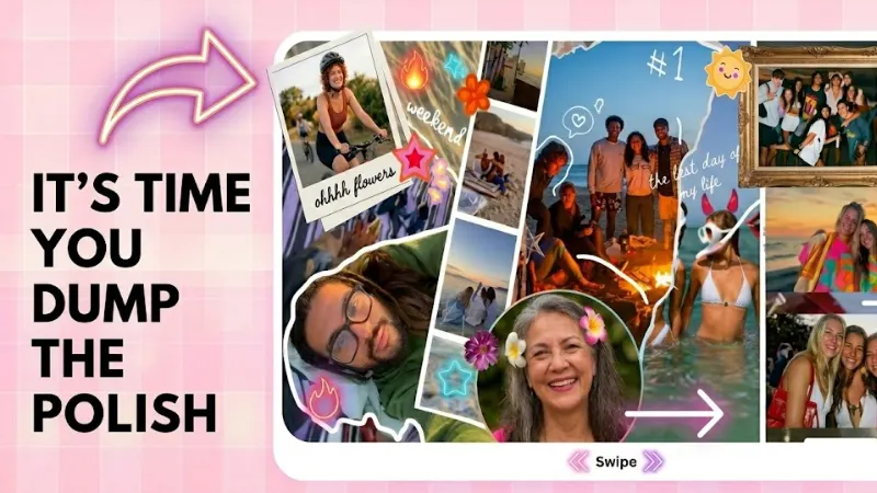
It’s a creative shift, and the brands leaning into it are doing something genuinely smart. There’s a type of post you’ve been seeing everywhere lately. Multiple images. One might be blurry. The lighting in another is a little off. There’s probably a screenshot in there somewhere, maybe a random close-up of something that doesn’t obviously connect to the others. The caption is two lines and reads like a passing thought. And somehow, genuinely, puzzlingly, it’s outperforming content that took days to produce. This is the photo dump carousel. And it’s not a fluke, a phase, or a workaround. It’s a real creative format that’s reshaping how brands show up online. Understanding why it works means understanding something much bigger about how audiences have changed. How we got here: the end of the perfect grid For most of the 2010s, the visual language of Instagram was a certain kind of controlled beauty. Flat lays. Lifestyle photography in golden hour light. Cohesive grids where every post matched the one next to it in tone, palette, and energy. The implicit promise was: we are polished, therefore we are trustworthy. It worked for a long time. High production value signalled investment, seriousness, brand identity. If your feed looked expensive, people assumed the product was too. But somewhere around 2021, and the timing isn’t coincidental, given what was happening in the world, audiences started feeling the distance.  The more a brand looked like a catalogue, the less it felt like something you could actually talk to. The polish had become a wall. People were exhausted by perfection because perfection, it turns out, is kind of lonely to look at. The creator economy changed the benchmark At the same time, a generation of creators were building massive audiences on content that looked nothing like traditional brand photography. Raw talking-head videos. Phone-shot vlogs. Carousel posts that were, frankly, just a bunch of pictures from someone’s week. The content was imperfect and immediate, and people loved it because it felt like being let in rather than sold to. Brands noticed. The photo dump carousel was the format they landed on, a way to borrow that same energy without abandoning social media entirely. “The slightly blurry image is not a mistake. It’s evidence that a real person was there, holding a real phone, in a real moment.” What a photo dump carousel actually is The name is borrowed from personal social media culture, where “photo dump” became shorthand for posting a batch of unrelated or loosely related images with minimal curation. The appeal was always the rawness, a little digital scrapbook of a week or a feeling, not a statement. Brands adapted this into carousels: multiple-image posts where the slides don’t follow a clean narrative, the aesthetic varies across frames, and the overall vibe is more “pulled from my camera roll” than “art directed in a studio.” A product might appear in slide one. Slide three might be a meme. Slide five could be a screenshot of a DM from a happy customer. Slide seven might just be a pretty sky with no context at all. Why the algorithm loves it Each swipe is an interaction. Each interaction tells the platform that someone is engaged, curious, actively spending time with this content. More slides equals more opportunities for engagement, which translates to more reach. This was true of educational carousels, the “tips and tricks” format that dominated creator content for years, but the photo dump adds another layer: unpredictability. You don’t know what the next slide is. That’s not an accident. That’s the whole mechanism. In a feed engineered to be smooth and endless and predictable, a post that makes you genuinely curious what comes next is doing something rare. The craft inside the carelessness Here’s where it gets interesting. Because the photo dump aesthetic looks effortless, it’s easy to assume it requires no effort. That’s not quite right. The brands doing this format well are making very deliberate decisions about which images look accidental. They’re choosing the slightly blurry shot over the sharp one intentionally. They’re writing captions with the kind of casual typo you’d let slide in a text to a friend. They’re selecting the lo-fi font because it reads as native to the platform. The “messiness” is considered. The lack of polish is, in a strange way, the polish. This is what makes photo dump carousels genuinely creative as a format, and not just a shortcut. The constraint is tight: you have to make something that feels unconstructed, which requires quite a lot of construction. Get it wrong and it reads as lazy. Get it right and it reads as human. The authenticity problem they’re solving Brands have been chasing “authentic” content for years, but the word has been so thoroughly co-opted by marketing speak that it’s nearly lost all meaning. We’ve had authentic moments, authentic connections, authentic storytelling, all delivered through the most produced content imaginable. Photo dump carousels sidestep this by showing rather than claiming. They don’t tell you a brand is real or relatable. They just show you something that looks like it came from a real person’s phone, and your brain fills in the rest. It’s a much more effective emotional shortcut than any tagline. “There’s a version of this format that’s cynical, and a version that’s genuinely warm. The difference is whether you actually believe in what you’re making.” What this means for content teams The practical implications are significant, and largely positive for teams that have been stretched thin trying to keep up with content demands. Photo dump carousels are significantly faster to produce than fully art-directed content. The raw material is often already there: product photos from a launch, behind-the-scenes moments from an event, screenshots of real customer conversations, ambient images from the office or a shoot day. The skill shifts from art direction to curation and sequencing, knowing which images to put together, in what order, to create a feeling. That’s a real skill. It just looks

The Photo Dump Carousel Is Not a Step Down Read More »