It’s a creative shift, and the brands leaning into it are doing something genuinely smart.
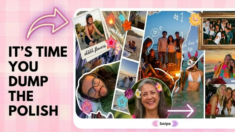
There’s a type of post you’ve been seeing everywhere lately. Multiple images. One might be blurry. The lighting in another is a little off. There’s probably a screenshot in there somewhere, maybe a random close-up of something that doesn’t obviously connect to the others. The caption is two lines and reads like a passing thought.
And somehow, genuinely, puzzlingly, it’s outperforming content that took days to produce.
This is the photo dump carousel. And it’s not a fluke, a phase, or a workaround. It’s a real creative format that’s reshaping how brands show up online. Understanding why it works means understanding something much bigger about how audiences have changed.
How we got here: the end of the perfect grid
For most of the 2010s, the visual language of Instagram was a certain kind of controlled beauty. Flat lays. Lifestyle photography in golden hour light. Cohesive grids where every post matched the one next to it in tone, palette, and energy. The implicit promise was: we are polished, therefore we are trustworthy.
It worked for a long time. High production value signalled investment, seriousness, brand identity. If your feed looked expensive, people assumed the product was too.
But somewhere around 2021, and the timing isn’t coincidental, given what was happening in the world, audiences started feeling the distance.
The more a brand looked like a catalogue, the less it felt like something you could actually talk to. The polish had become a wall. People were exhausted by perfection because perfection, it turns out, is kind of lonely to look at.
The creator economy changed the benchmark
At the same time, a generation of creators were building massive audiences on content that looked nothing like traditional brand photography. Raw talking-head videos. Phone-shot vlogs. Carousel posts that were, frankly, just a bunch of pictures from someone’s week. The content was imperfect and immediate, and people loved it because it felt like being let in rather than sold to.
Brands noticed. The photo dump carousel was the format they landed on, a way to borrow that same energy without abandoning social media entirely.
“The slightly blurry image is not a mistake. It’s evidence that a real person was there, holding a real phone, in a real moment.”
What a photo dump carousel actually is
The name is borrowed from personal social media culture, where “photo dump” became shorthand for posting a batch of unrelated or loosely related images with minimal curation. The appeal was always the rawness, a little digital scrapbook of a week or a feeling, not a statement.
Brands adapted this into carousels: multiple-image posts where the slides don’t follow a clean narrative, the aesthetic varies across frames, and the overall vibe is more “pulled from my camera roll” than “art directed in a studio.” A product might appear in slide one. Slide three might be a meme. Slide five could be a screenshot of a DM from a happy customer. Slide seven might just be a pretty sky with no context at all.
Why the algorithm loves it
Each swipe is an interaction. Each interaction tells the platform that someone is engaged, curious, actively spending time with this content. More slides equals more opportunities for engagement, which translates to more reach. This was true of educational carousels, the “tips and tricks” format that dominated creator content for years, but the photo dump adds another layer: unpredictability.
You don’t know what the next slide is. That’s not an accident. That’s the whole mechanism. In a feed engineered to be smooth and endless and predictable, a post that makes you genuinely curious what comes next is doing something rare.
The craft inside the carelessness
Here’s where it gets interesting. Because the photo dump aesthetic looks effortless, it’s easy to assume it requires no effort. That’s not quite right.
The brands doing this format well are making very deliberate decisions about which images look accidental. They’re choosing the slightly blurry shot over the sharp one intentionally. They’re writing captions with the kind of casual typo you’d let slide in a text to a friend. They’re selecting the lo-fi font because it reads as native to the platform. The “messiness” is considered. The lack of polish is, in a strange way, the polish.
This is what makes photo dump carousels genuinely creative as a format, and not just a shortcut. The constraint is tight: you have to make something that feels unconstructed, which requires quite a lot of construction. Get it wrong and it reads as lazy. Get it right and it reads as human.
The authenticity problem they’re solving
Brands have been chasing “authentic” content for years, but the word has been so thoroughly co-opted by marketing speak that it’s nearly lost all meaning. We’ve had authentic moments, authentic connections, authentic storytelling, all delivered through the most produced content imaginable.
Photo dump carousels sidestep this by showing rather than claiming. They don’t tell you a brand is real or relatable. They just show you something that looks like it came from a real person’s phone, and your brain fills in the rest. It’s a much more effective emotional shortcut than any tagline.
“There’s a version of this format that’s cynical, and a version that’s genuinely warm. The difference is whether you actually believe in what you’re making.”
What this means for content teams
The practical implications are significant, and largely positive for teams that have been stretched thin trying to keep up with content demands.
Photo dump carousels are significantly faster to produce than fully art-directed content. The raw material is often already there: product photos from a launch, behind-the-scenes moments from an event, screenshots of real customer conversations, ambient images from the office or a shoot day. The skill shifts from art direction to curation and sequencing, knowing which images to put together, in what order, to create a feeling.
That’s a real skill. It just looks different from what content teams were trained on. And it opens up space for people who are good at taste and instinct rather than technical production.
High-production content still has its place
This isn’t a eulogy for beautiful photography or thoughtful design. There are contexts where high-res, carefully lit, professionally produced imagery is exactly right, product launches, brand campaigns, anything that needs to communicate quality and intention at a glance. The photo dump format doesn’t replace any of that.
What it does is fill a gap that brands have been awkwardly papering over for years: the space between campaigns. The day-to-day content that keeps an account alive and a community engaged. That space doesn’t need a studio. It needs someone with a good eye and a willingness to let things be a little imperfect.
A format that reflects a broader shift
Step back far enough and the photo dump carousel is one piece of a much larger pattern: audiences increasingly preferring content that costs something personally, not financially. They want to feel the presence of a human decision-maker, someone who chose this image, wrote this caption, thought this was worth sharing. Production value used to be the proxy for that care. Now it can get in the way of it.
The brands that are figuring this out aren’t abandoning quality. They’re expanding their definition of it. Quality can mean a perfectly lit product shot. It can also mean a photo from someone’s actual Wednesday afternoon that makes you smile in a way you can’t quite explain.
Both are intentional. Both take skill. One just looks like it doesn’t, and right now, that’s exactly the point